A New Logo For LA
Graphic Design USA Weekly Design Briefing
This is the July 12-July 16, 2021 edition of Graphic Design USA Weekly Design Briefing - this week’s round up of our most popular design stories from GDUSA magazine. If you like it and want more in your inbox, consider subscribing.

Enter Our Annual GDUSA Web Design Awards
We invite you to enter the 2021 American Web Design Awards™. This is our annual showcase of the power of design to enhance websites, and online and interactive experiences. Winners receive an embossed Certificate of Excellence. They will also be eligible for publication in our Web Design Annual — in print and online — that appears in October. It’s a great opportunity to be recognized by clients, managers, colleagues and the community for design excellence in the fastest-growing area of design. The deadline is Friday August 20, 2021.
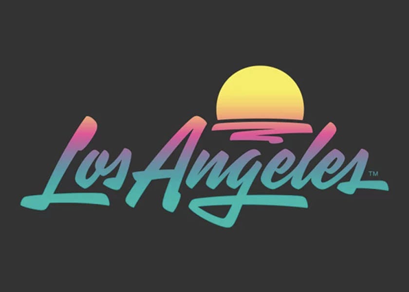
Los Angeles is a city with a population of four million and just as many ways to think about what it symbolizes. That was the essence of the challenge presented to artist Shepard Fairey’s Studio Number One and design firm/font creator House Industries when the Los Angeles Tourism & Convention Board tasked them with creating logo and brand identity for Los Angeles as a destination. The solution: an acid-washed word mark that seeks to exude SoCal’s sunny optimism with a hint of street-level cool. Fairey says that he was inspired by classic art deco, hand-painted signage, and Mexican restaurant scrips, adding: “The point was to make it open to interpretation for different people, and keep it distinct from what other cities are doing.” The gradient colors, he explains, are meant to reflect the city’s diversity and its epic sunsets. “The identity has got a really strong, ownable personality to it that allows anyone to project something about themselves onto it,” Fairey says. The logo is the first rebrand for LA Tourism in a decade, with a hoped-for appeal to tourists and business conference and meeting planners. The design will be used in everything from letterhead and business cards to conference banners and tv ads.
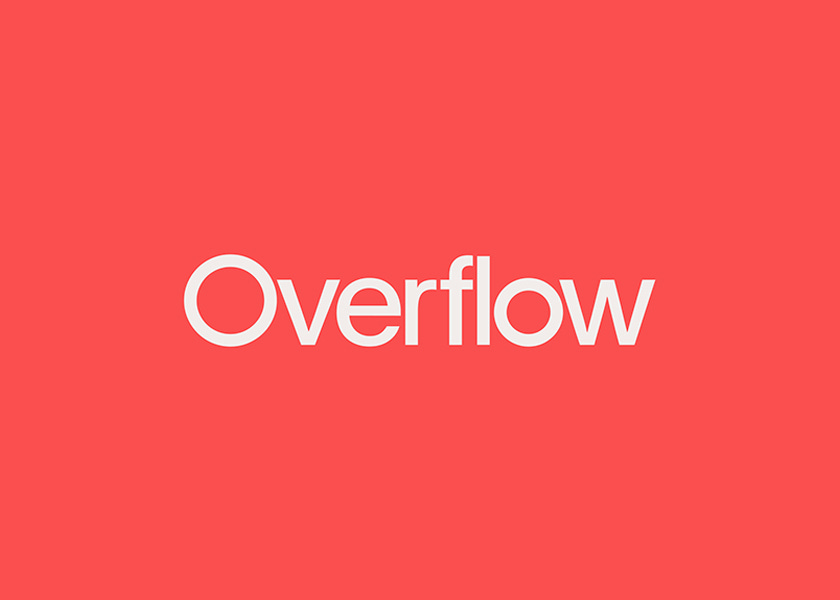
Philanthropy platform Overflow‘s forthcoming rebrand with Brooklyn-based design and tech agency Alright Studio illustrates the important role that good design can play in amplifying the reach and impact of important causes – and with making complicated ideas seem more accessible. Overflow is betting that fresh design and an approachable voice will set them apart in the nonprofit space, and inspire a new generation of philanthropists who have been donating more in the past year than ever before. Based on Overflow’s core tenet that “the world of the generous gets bigger, exponentially,” Alright defined a visual identity that could grow with the venture. The logomark has no singular static shape and is built in 3D so that it can take different moods at different times. Alright also customized a new typeface for Overflow, via Family Type’s Universal Sans, that treads the line of legible modernity and technical construction. Above all, Alright sought to make Overflow feel genuine. “If you look at most donation platforms or nonprofit websites, they feel very transactional,” says Vance Roush, Founder of Overflow. “We wanted to move away from that with our branding for Overflow. We wanted to create an experience that felt like a celebration rather than a transaction.”

Metsä Board, a European producer of fresh fiber paperboards, has appointed Nathan Pajka to the new position of Sustainability Specialist for the Americas. Based in the Norwalk CT office, Pajka is working with sales and marketing to help customers with sustainability information, data and education relating to Metsä Board’s lightweight paperboards and, more broadly, how customers can reduce their carbon footprint. He will work in tandem with Metsä Board’s Product Safety and Sustainability team in Finland to offer a range of Sustainability services as well. Says Johan Holvik, President & VP Sales, Metsä Board Americas: “This new appointment is further strengthening Metsä Board’s leading position in sustainability and the commitment to providing support to our customers in terms of improving product safety, ensuring compliance and reducing the environmental impacts of packaging.”
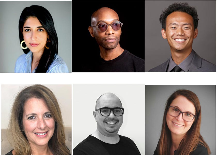
AIGA has named seven new members to its 2021 National Board of Directors, elected by the entire AIGA membership. “Bringing in new Board members is our chance to renew and extend our expertise and reach for the profession. They join a dynamic group of leaders who will continue to help AIGA deepen the impact and value of design across our community and industry and strive to change the future of design,” states Bennie F. Johnson, executive director of AIGA. Adds Ashleigh Axios, president of the National Board: “I am excited to welcome AIGA’s newest National Board members. This group brings fresh energy, perspective, a wealth of knowledge, and a commitment to making meaningful improvements for our members, partners, and the design profession at large.” This year’s board slate was selected by the 2021 Board Nominating Committee chaired by Lisa Babb of Georgia Institute of Technology.
Have a meaningful evening!
For further reading…
GDUSA June 2021 Digital Edition
LogoLounge 2021 Trend Report by Bill Gardner, Founder + President, logolounge.com